Active life of a Peace Corps logo
- Published: August 4, 2011
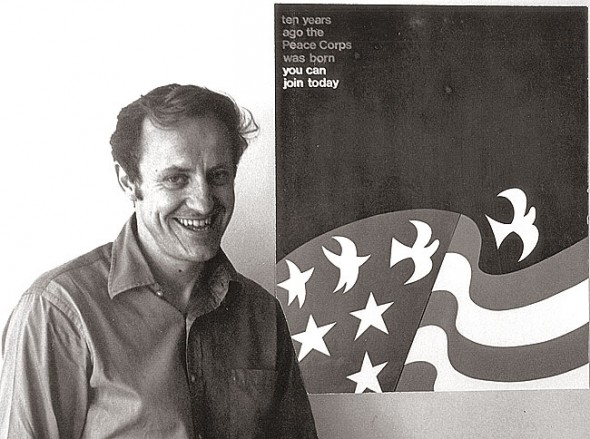
Sometimes the force of design is powerful enough to sustain a momentum completely independent of the designer. That has been the story of the Peace Corps logo that local resident David Battle originally designed for the international work and friendship agency on its 10th anniversary in 1971. Born as the idea for a promotional poster for the Corps, Battle’s design not only helped propel the corps into this year’s 50th anniversary but also sustained a trajectory that launched it right off the page and into outer space. Battle’s own journey through his design has been one of constant surprises.
The design is graphically pointed and simple: a dark blue background with an American flag, whose stars morph into white doves taking flight. Battle, who was at the time vice-president and creative director of graphics at Vie Design Studio, created the logo in early 1971 as a call for entries to a poster contest for the Peace Corps in its 10th year. But that year was one of political change, as in July President Nixon folded Peace Corps in with other federal service groups into one ACTION agency. And while Battle was not privy to the internal politics, he did notice that Peace Corps failed to contact him about the printing of the poster. So he wrote the Corps a letter of inquiry, soon after which things got a little strange.
In the summer of 1971 a neighbor of the Battles’ said she had seen someone in uniform snooping around their house while they were gone. Then another friend told them that the Greene County Sheriff had visited asking him about the Battles and their habits, including the question, “Does Mr. Battle hold wild parties?” And just as he began to get really creeped out, he received an unexpected response to his letter about the poster. Toward the end of 1971, Congressman Clarence Brown, Jr. and Peace Corps Director Joe Blatchford invited Battle with his wife Esther and their son Mark to a ceremony at the State House in Washington, D.C. honoring him for his design of the commemorative stamp for the 10th anniversary of the Peace Corps.
Battle was “quite surprised” by the turn of events that had turned his simple Peace Corps poster design into a more formal commemorative stamp, he said in an interview this month. But it suddenly became clear that the police had been checking to make sure the Battles were fit for an insider’s visit to the nation’s capitol. The trip was a memorable one in which the family was treated to a banquet dinner, tours of the White House and the Capitol, fancy restaurants, and a stay at the congressman’s home. And though the poster was never circulated, the stamp had its first day issue on Feb. 11, 1972, and Battle was pleased that it included only a minor deviation from his original poster design.
Battle may have finished the design, but the design hadn’t yet finished with Battle. In the decades that followed he began seeing his design crop up on Peace Corps brochures, advertisements and other promotional materials. Some friends visited Sri Lanka and sent him a card with a modified version of the design on the cover. Someone else gave him a key chain bearing his design along with a quote by statesman Sargent Shriver, first executive director of the Peace Corps. Yet another version of his design appeared on a belt buckle in enameled red, white and blue.
While memorabilia and trinket production is difficult to control, Battle felt that the design was still his and that he had never granted license for its alteration. So in 1993, in order to maintain the integrity of the design contract, the Peace Corps purchased the copyright. The redesigns of his artwork had bothered Battle, but once the rights were transferred, he felt satisfied that the proper avenues of ownership had been achieved.
“I created my design for the poster only — they saw it as more,” Battle said. And so he sold it to them. The essence of his design still resides at the top of every page of the Peace Corps Web site and on much of its promotional material.
And yet, for Battle, the design lived on.
In 2008 Peace Corps called to tell him that former Peace Corps volunteer Joe Acaba was taking the Discovery on a mission to the international space station and, due to the positive impact his Peace Corps service had on his life, would fly the Peace Corps flag with Battle’s design on it. It seemed fitting, Battle said — he had conceptualized the blue background of his design as space, the final frontier of Peace Corps’ mission. In fact, Neil Armstrong had been a member of the Peace Corps committee that chose Battle’s design for the poster (and like the Peace Corps, both the space program and the postal department were also scheduled for budget cuts under Nixon’s presidency).
Finally, this year, for the 50th anniversary of the Peace Corps, unbeknownst to Battle, his design resurfaced once again when a friend called to tell him that the stamp was being featured in the 2011 engagement calendar for the Smithsonian Museum, which was adding to its permanent collection memorabilia for the Peace Corps’ 50th anniversary.
“When you think of the massive collection of the Smithsonian — known as ‘the attic of the United States’ — and the odds of them selecting the Peace Corps stamp to include in this year’s calendar, it’s remarkable,” Battle said in an interview this month.
And of course, as with every piece of history with his Peace Corps design, Battle neither asked for the design to be chosen, nor did he even know about it until it was already decided.
“No, I didn’t know! That’s been the story all along,” he said, smiling, and still a little incredulous.
The Yellow Springs News encourages respectful discussion of this article.
You must login to post a comment.
Don't have a login? Register for a free YSNews.com account.
Parkinsons.jpg)


No comments yet for this article.