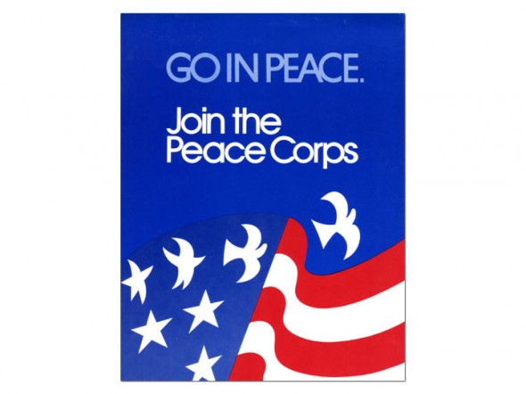
Battle's design for the Peace Corps' 10th anniversary poster, “Go in Peace,” 1971. Courtesy of the Peace Corps Digital Library.
Local design goes universal
- Published: July 29, 2011
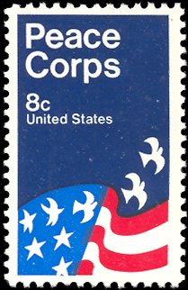
David Battle’s design for the Peace Corps could be aptly called a classic. He originally created the image for a poster contest for the 10th anniversary of the Peace Corps in 1971. And while the poster was never widely circulated, the design was so representative of the mission of the Corps, that same year its leaders along with the U.S. Postal Service collaborated to make a commemorative stamp to mark the Peace Corps’ first successful 10 years of international service and friendship.

The Peace Corps commemorative stamp was adapted slightly from Battle's poster design.
While the original poster design (feature image) had only one bird, the final designers chose to adapt the image to the more vertical orientation of the stamp by including two birds.
The design stuck as the defacto image of the Peace Corps, and for several succeeding decades, publicly adulterated versions of the image would appear on greeting cards, political and election brochures, clothing and Peace Corps promotional material. Battle continued to be surprised by the alteration of his design, and finally sold the copyright to the Peace Corps in 1991.
In 2009 a Peace Corps flag with Battle’s design went with a former Peace Corps volunteer turned astronaut to the International Space Station. And this year, the 50th anniversary of the Peace Corps, the stamp was chosen from the Smithsonian Permanent Collection to be included in its 2011 engagement calendar.
One Response to “Local design goes universal”
The Yellow Springs News encourages respectful discussion of this article.
You must login to post a comment.
Don't have a login? Register for a free YSNews.com account.


It’s a rare type of design, I have this stamps, I am collectors of US post stamps and this also includes in my collection.
Cheers,
Drew